Tag
Client, Product, Mobile
Client
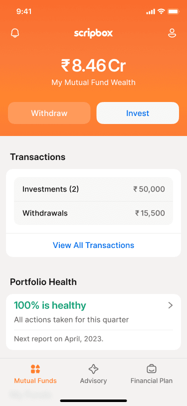
Scripbox
Timeline
Aug - Sep 2024
Collaborators
Vinu Aakash - Designer
Akshay - PM
Context
During a volatile investment market phase, Scripbox saw a sudden spike in withdrawals. This behaviour clashed with long-term investment principles and created challenges for the business. The client wanted to reduce the number of withdrawals in the app.


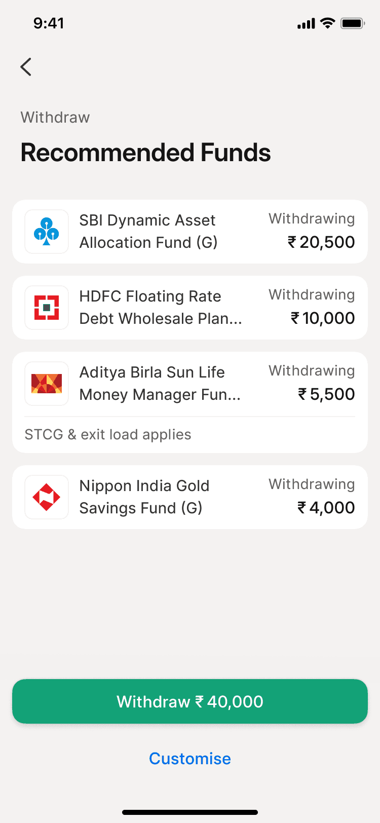
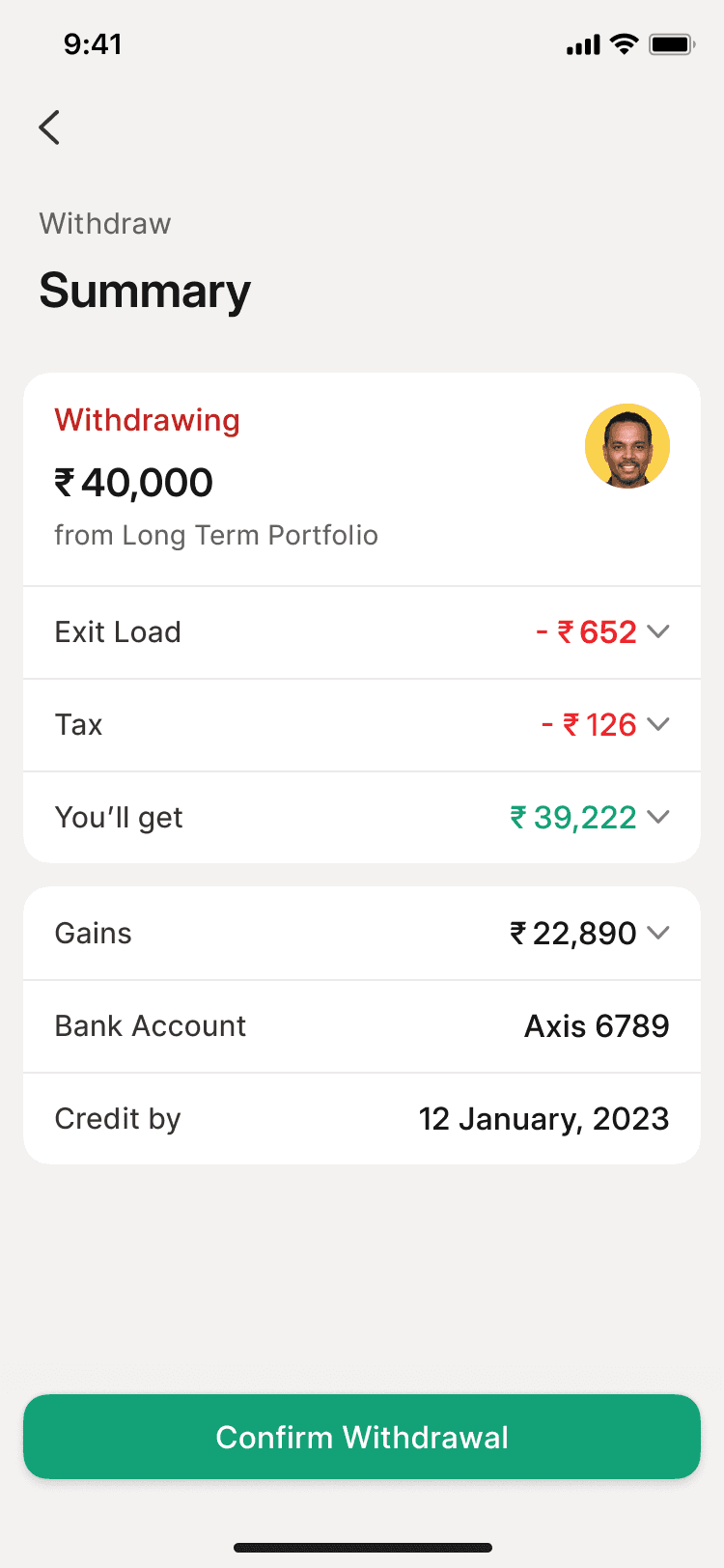

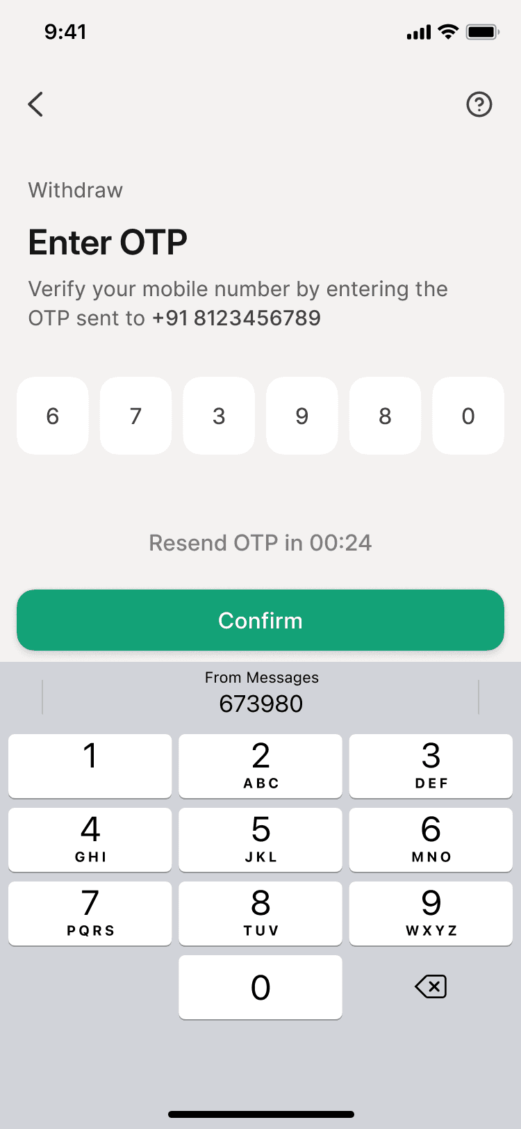
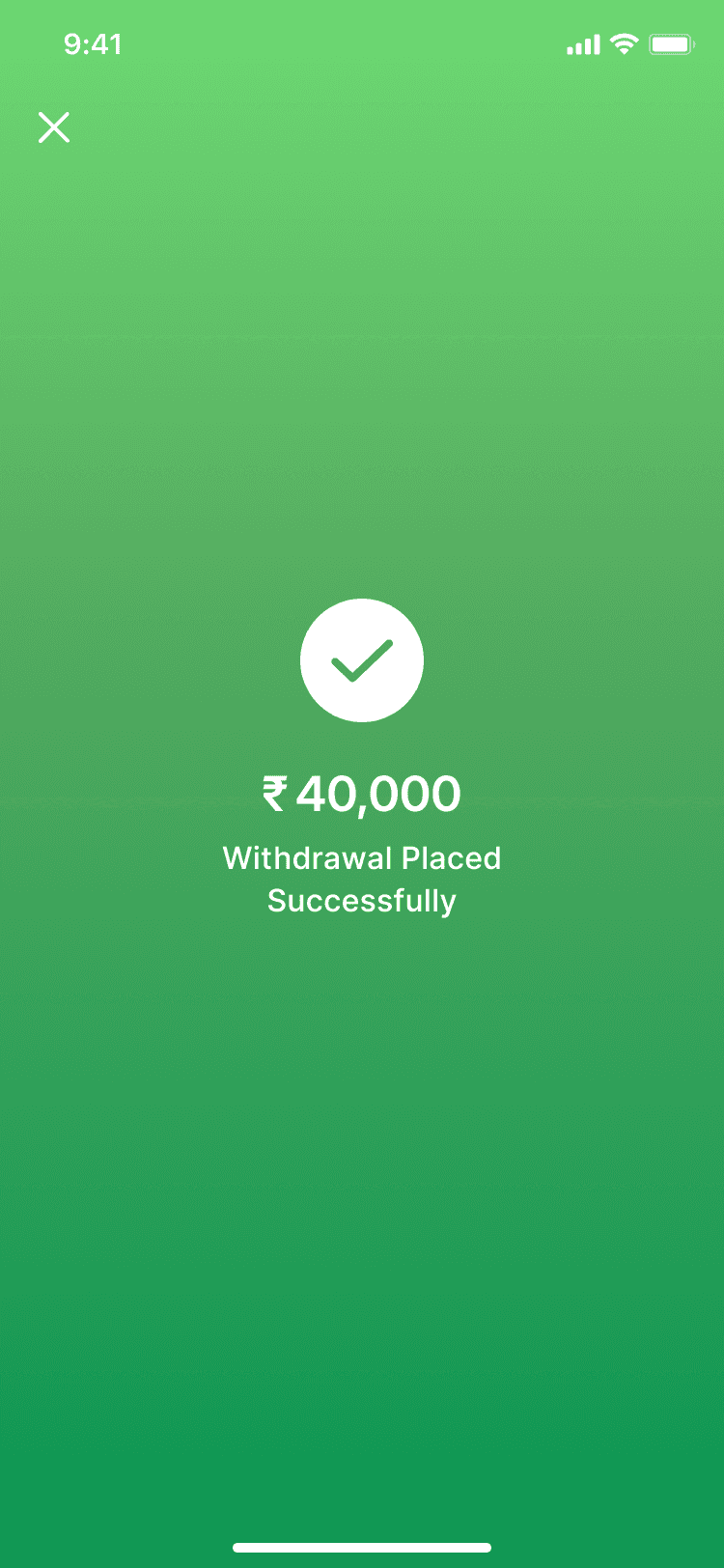
Existing withdraw user flow
Discover
I started by asking what was driving users to withdraw. Fear and uncertainty was the primary reason. People weren’t aware that mutual funds are a long term investment product, and short-term fluctuations are normal. I wondered if instead of just telling users to stay invested, I showed them what they might lose by withdrawing?
I audited the existing withdrawal flow (which I had previously designed) to identify opportunities to introduce this educational layer without disrupting the current experience.
Both the ‘withdrawal amount’ and ‘summary’ screens felt like a good moment to step in. But the ‘withdrawal amount’ screen had more empty space and also it being at the start of the flow, felt like a better place to convey a narrative.
Iterate
I started by considering the different factors of the withdrawal. As it doesn’t just reduce the current balance but also affects things like capital gains tax, potential growth, and reaching life goals on time.
I wanted to bring these consequences in a way that felt interactive—almost like an investment calculator, where changing the amount, changes what’s being affected.
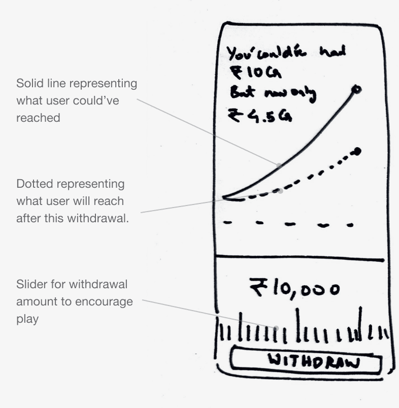
Iteration 1
Iteration 2
Iteration 3
Initial Iterations
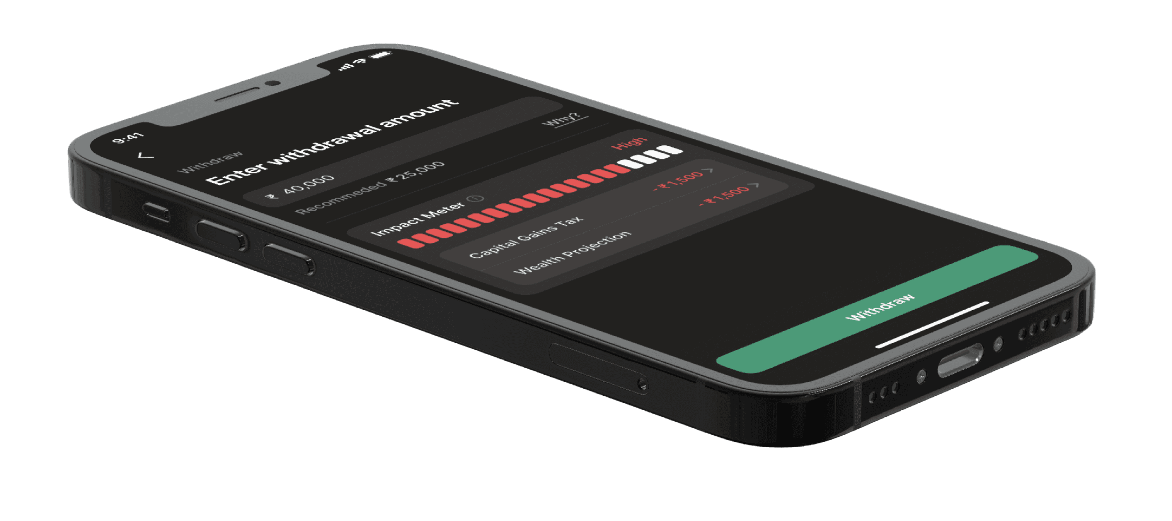
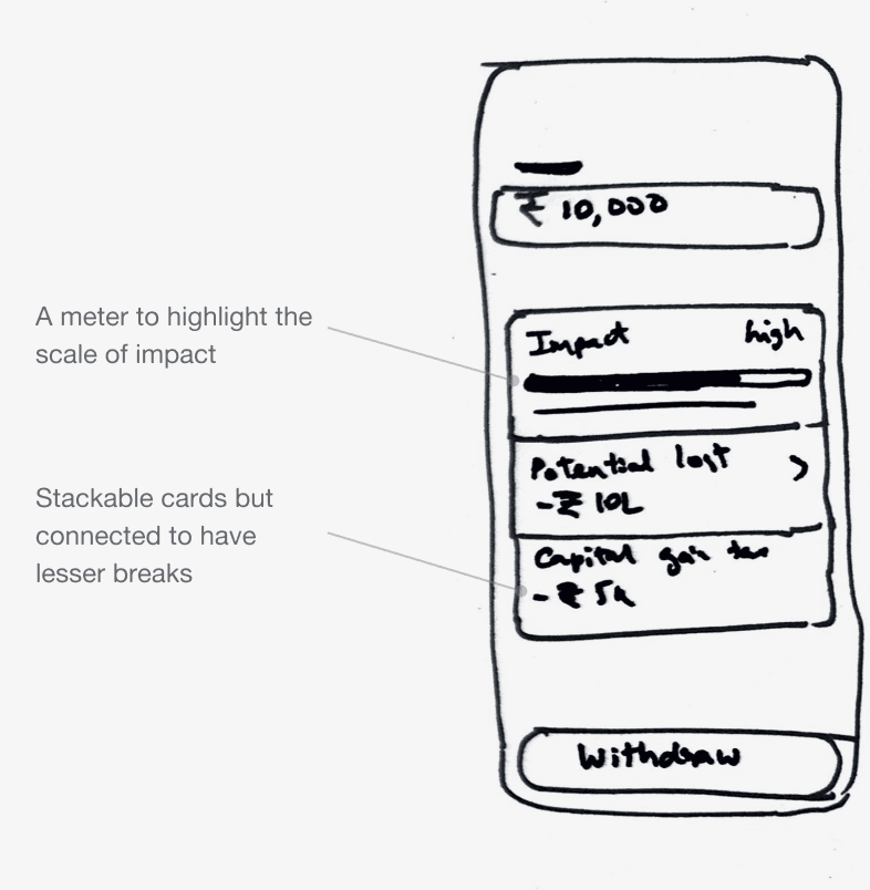
Finally I narrowed down on the third iteration and started designing a high-fidelity screen.
I liked the idea of using a meter as a visual anchor — both to show the impact and to tie the whole narrative together. Showing the potential loss amount added a sense of urgency and highlights the risk, making the message more impactful.
Variation of impact meter card
I presented the new design as a prototype with the Scripbox and they liked that it fit smoothly into the flow, but felt the tone came off a bit too negative for the brand.

High fidelity design of iteration 3
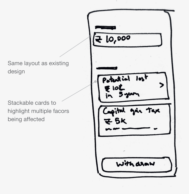
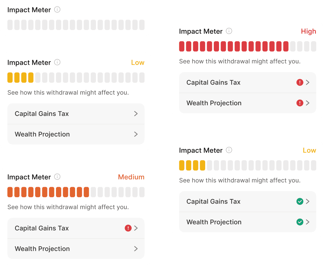
Pivot
With the new feedback, I revisited the design to reframe the impact factors as ways for users to “save” on their withdrawal, just like food delivery apps suggesting applying coupons.
Each item reframed a warning as an opportunity to save. Tapping them revealed helpful insights that guided users toward smarter choices.

Final design
Outcome
In the first two months of launch, we saw:
14.2%
Number of users withdrawing
66.9%
Adoption rate for the capital gains tax saving
33.4%
Adoption rate for the potential loss savings
After Thoughts
The final design did the job, but I do wish we had the chance to A/B test the third iteration approach, comparing fear-based vs. opportunity-driven offers could’ve uncovered deeper behavioural insights of the Scripbox user base.